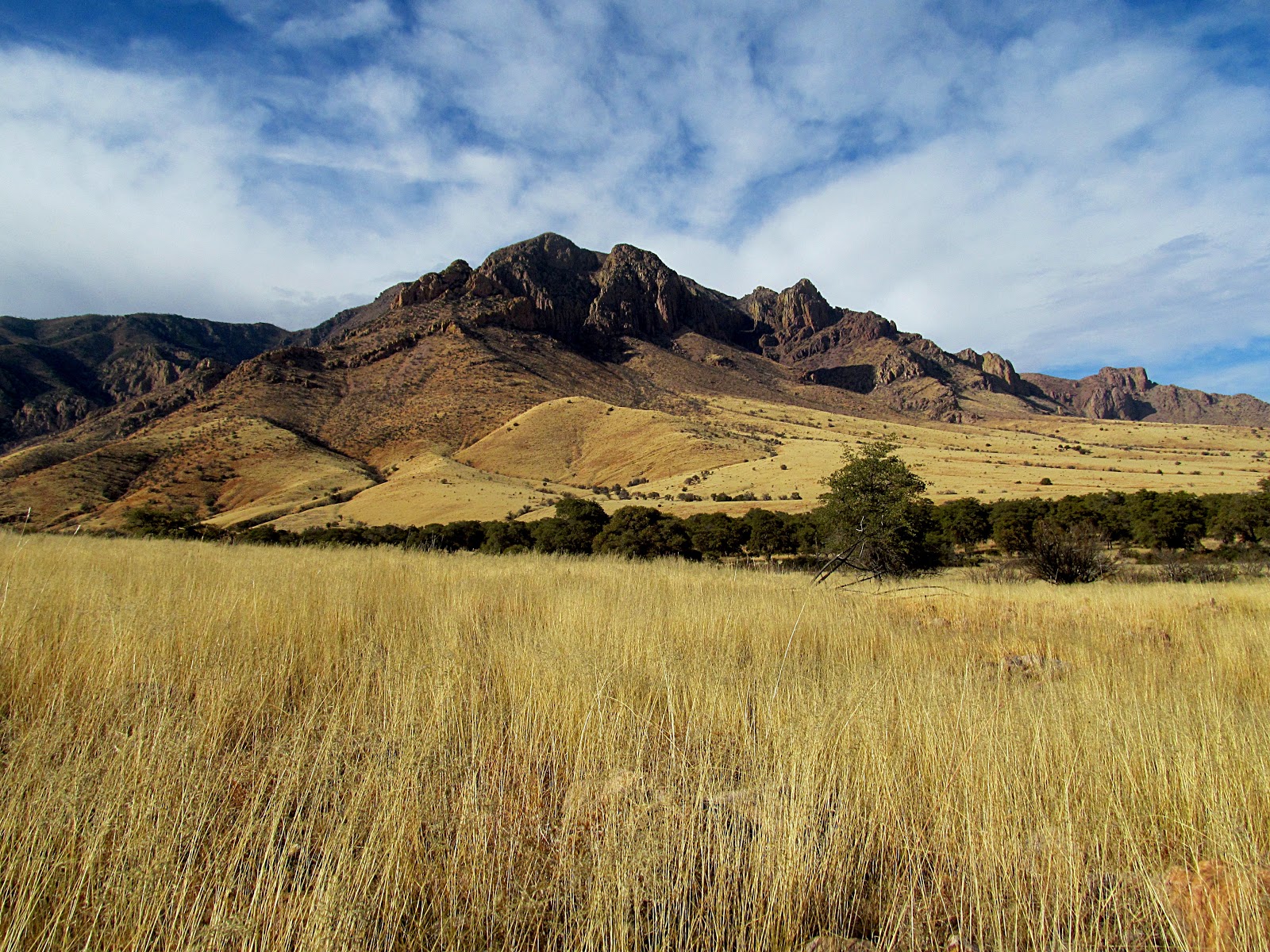
I continue to struggle with the concept of "how people see", specifically how it relates to what makes an interesting photograph. Recently, I stumbled into a little experiment using Facebook and ended up posting 3 images and comparing their performance. The metric I used was a "like" indicating a positive response from a viewer. The 3 images were taken from the same location (mouth of Sulphur Canyon but of 2 different subjects) and posted on 3 consecutive days (Friday through Sunday). Image 1 was of a view towards Darnell Peak, a multi-image panorama but presented in Black and White. After spending several hours on creating the image I was very pleased with final outcome and posted it. Image 2 was a simple snapshot of Portal Peak and presented in color, while image 3 was another multi-image panorama of Portal Peak also presented in color. My expectation was the first image would preform the best. It was a good composition, with the volcanic walls of the Chiricahua mountains rising up from the grasslands, the moon in the background, nice shadowing, and crisp details that draw the eye into the scene. Yet after several days it received only 35 likes so I added the snap shot of Portal Peak (image 2). Surprisingly, the quick snapshot with the top of Portal Peak in shadow, the result of a passing cloud, picked up 87 likes and was featured as a group cover image where it picked up an additional 70 likes. I then added the final multi-image panorama, a "big picture" view, which received 46 likes. In terms of work load the most time was spent creating image 1, the next was image 3, and image 2 (the snapshot) took the least amount of time.
Image performance, whether in the form of views or likes is important since I use the imagery as a way to create interest in the area and in the long run generate business for the
Painted Pony Resort. I can only conclude that color performs better than Black and White, and color contrast in an image is more appealing than the scope of an image. Finally, the amount of work spent creating an image is not proportional to its public appeal.
I still like the first image the best.
 |
| Image 1, Looking up towards Darnell Peak on the south side of Sulphur Canyon. |
|
|
 |
| Image 2. Portal Peak from the south side of Sulphur Canyon. |
|
|
 |
| Image 3. Portal Peak and the mouth of Sulphur Canyon. |


I'm with the majority that I like the middle one, image 2.
ReplyDeleteI lived in B&W until we got a color tv AND when I went to a Buffalo Bills game and saw the referee's flag was bright yellow, unlike what I'd seen on our B&W tv.
DeleteYep, everyone likes number 2. I thought it was a little dark with to much shadowing where the cloud is passing over Portal Peak, but I guess it heightens the contrast between the peak and the sky which creates the appeal and draws the eye.
ReplyDeleteI also grew up with B&W TV, my father was dead set against a color TVs for some reason. He did finally get one after I moved out.
My father also resisted getting a color TV. He also threw out a LOT of cigarette lighters from his cars since he had lit his cigarettes with matches for so long [born in 1904] and I laugh as I picture him throwing out cigarette lighters that came with the car. Oops.
DeleteThe rule of thirds is best depicted in image two.
ReplyDeleteYour quite right but it seems to me that the rule of thirds is only one component of a finished image.
ReplyDelete